


JOIN OUR NEWSLETTER
About This Project
Summary
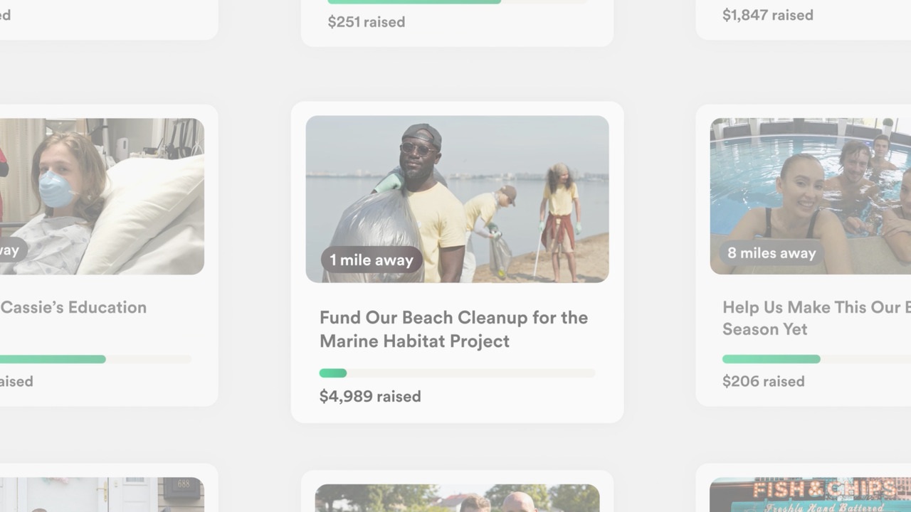
GoFundMe replaced its flat progress bar with the Progress Circle — a data-proven design shift that increases dollars raised — as the anchor of a full rebrand: new color, custom typeface, and a conceptual system built on humanity, community, and optimism. The strategy: evolve an inaccessible, flat design system into a bolder identity designed to create a stronger community around giving and getting help, ultimately driving more dollars toward the causes that need them most.
Goals & Objectives
Strengthen the sense of shared community around giving and getting help; unify individual and nonprofit support under one identity so more people find the right help, faster; remove barriers of an inaccessible design; and use behavior-driven design to move more dollars to the causes that need it.
Results & Impact
Increased brand engagement and financial support to worthy humanitarian causes. - 70% increase in requests for a demo after the new design was applied to the GoFundMe Pro product page - +6 point lift in brand awareness following the redesign - 100% positive press
JOIN THE NEWSLETTER